Current Kitchen Design
Size - 8'x8' (approximately, I need to remeasure).
Paint color - Cream (swiss coffee to be exact), which matches the rest of the apartment.
Cupboards - Country style, reddish-brown stain, crappy condition.
Appliances - Almond finish, poor working condition (vent doesn't work, oven is temperamental, and the fridge does weird things to my food).
Backsplash - Blue and white fake-tiled wallpaper.
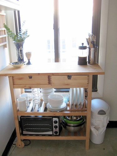
Countertop - White with gold flecks laminate, metal-edged, which is only one foot wide. To mitigate the counter space crisis, I've also purchased a butcherblock storage unit that is unfinished natural wood. This is also to be considered in the final design.
Floor - Stick-on vinyl tiles, sea-green variegated.
Current Kitchen Design
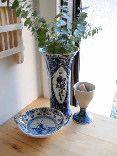
Delft China
As far as the color scheme goes, I've never really used blue before in design. It's odd to say, but I don't think my mom ever did either, so it's just something I've grown up without. I have taken advantage of the blue though, and brought out my Delft china. This is one thing that I would love to continue to be able to display, as it's meaningful to me, but I'm not sure what to do if I get rid of the blue.
As far as constraints go, I think the main things that I don't mind too terribly are the floor, despite it being a cheapo solution, and the wall color. I'm usually more of a fan of pure white rather than cream, but it's a generic apartment solution to paint the whole place the same color, so it's fine.
So there you go, folks! A pseudo-blank slate that I will be working through the design for over the next couple of days. Again, I'm not sure how much of it all will be feasible, but I have a few ideas up my sleeve as to what I can do to liven it up. Stay tuned for more!


2 comments:
Ai, yi, yi. I don't know about the feasibility of remodeling a kitchen you don't own. If you should do something like install new cabinets, you would have to leave them behind when you move, so who would want to do that? As for the rest... about the only thing you can do, I think, is but some free-standing storage units and such. Maybe change the curtains. That sort of thing. It will be interesting to see what you do come up with, though.
I totally agree with you that major renovations are completely out of the picture for most renters. Mostly this is just an exercise to see if I can come up with some creative ways of refreshing the look of the kitchen without totally doing a renovation. That said, I might try and talk my landlord into doing some larger things like replacing the appliances, given that they are in terrible condition. Thanks for stopping by and I hope you will check up on what I'm doing!
Post a Comment