The house itself is the rectory for St. John's Episcopal Church in Georgetown. Designers submitted their designs for 16 different spaces throughout the house and yard and were selected by the charity board and the church board. They have six weeks to complete their designs and it will be shown to the public starting April 18th.

First Floor Plan
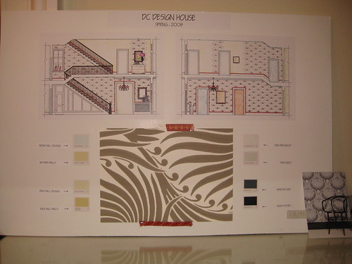
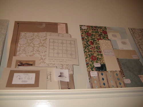
 Two spaces on the first floor (the front porch and the living room) did not have boards or designers to explain what was going on, so I will be curious to see what goes on there. The hallway area, which includes both the first and second floors, will have a gorgeous wallpaper covering sections of the wall, and I'm really tempted to get some of it myself, even though I have no idea what I would do with it. The whole pattern is on the postcard in the lower right of the picture, and it's fantastic.
Front Hall Design Board
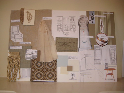
Taking a left out of the hallway, next is the Library. The designer in here actually got to start a little early because she is putting in custom bookcases around the front window, and had to rip out some existing shelves. My favorite part of the library is the gorgeous Scandinavian Grandfather clock...I've dreamed of one like that for years and there are several examples in my house books.
Library Design Board
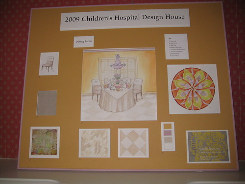
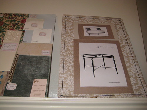
Walking out of the Library, next is the Dining Room. I'm curious to see how this one turns out, as the Designer indicated there will be lots of surprises. I think there will be some nice touches, such as the purple and clear crystal chandelier, but also think it will be a bit dark, as there wasn't a lot of natural light in the room. I felt it deserved a lighter color palette. The round design on the right side of the board is the pattern for dishes which she will set the table with, and the inspiration for the colors in the room. She does plan to paint the floors, which are currently a dark wood, with a white-washed kind of checkerboard pattern, so that should lighten it up a bit in the room.
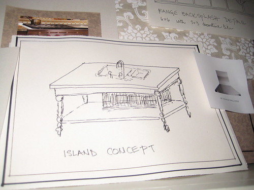
Walking back into the Kitchen from the Dining Room, I see what in my mind will be the biggest transformation. Unfortunately I didn't take any pictures of the actual rooms themselves as they currently are, but it will be a huge change. The main idea is to retain the functionality of a rectory kitchen, while creating a sort of Victorian, non-built-in furniture feel. It will be totally gutted, with the cupboards and the stove, fridge, and dishwasher fitting more gracefully into their surroundings. I noticed that the wallcolor, a pale blue called Skylight, was the same as the Library, so I asked if they had coordinated, and they hadn't. It will have a different effect in the Kitchen though, with the accent colors being red and green, as opposed to the beige and creams of the Library. The island, the centerpiece of the Kitchen, will look more like a freestanding piece of furniture, despite the sink and dishwasher being incorporated into it, and will be painted a deep, vibrant red.
Dining Room Design Board
Walking back into the Kitchen from the Dining Room, I see what in my mind will be the biggest transformation. Unfortunately I didn't take any pictures of the actual rooms themselves as they currently are, but it will be a huge change. The main idea is to retain the functionality of a rectory kitchen, while creating a sort of Victorian, non-built-in furniture feel. It will be totally gutted, with the cupboards and the stove, fridge, and dishwasher fitting more gracefully into their surroundings. I noticed that the wallcolor, a pale blue called Skylight, was the same as the Library, so I asked if they had coordinated, and they hadn't. It will have a different effect in the Kitchen though, with the accent colors being red and green, as opposed to the beige and creams of the Library. The island, the centerpiece of the Kitchen, will look more like a freestanding piece of furniture, despite the sink and dishwasher being incorporated into it, and will be painted a deep, vibrant red.
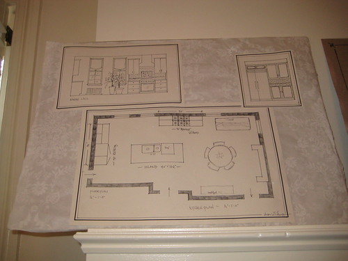
Kitchen Design Board - Sketches and Floor Plan
Kitchen Design Board - Fabrics and Paints
Kitchen Design Board - Breakfast Nook
Kitchen Design Board - Island Concept
Just off of the Kitchen is a small space that will house the washer and dryer, designed in an English Garden style. I didn't get a picture of the design board, but it will look nice, with cabinets to hide the washer and drying themselves.
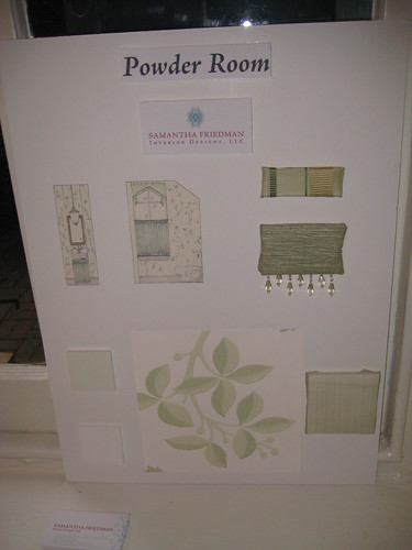
Back in the Hallway, there is a little powder room overlooking the garden. The design takes advantage of this fact by pulling in fresh tones of green and white. It isn't totally my style, but it suits the house.
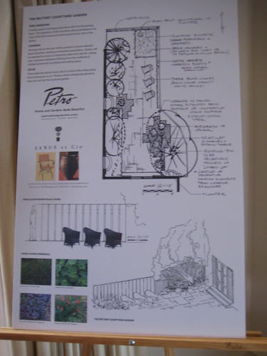
The garden is accessible from the Living Room and will have a facelift as well. It will have a couple of additional seating areas, but I'm a little skeptical about the way the three blue chairs are lined up along the fence. While aesthetically it's nice, I can't imagine having a conversation while sitting in that configuration.
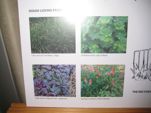
Shade Loving Plants for the Garden
Back in the Hallway, there is a little powder room overlooking the garden. The design takes advantage of this fact by pulling in fresh tones of green and white. It isn't totally my style, but it suits the house.
Downstairs Powder Room Design Board
The garden is accessible from the Living Room and will have a facelift as well. It will have a couple of additional seating areas, but I'm a little skeptical about the way the three blue chairs are lined up along the fence. While aesthetically it's nice, I can't imagine having a conversation while sitting in that configuration.
Garden Design Plan
Shade Loving Plants for the Garden
As this post is getting quite long, I think I will leave the second floor for tomorrow. Stay tuned!
No comments:
Post a Comment