Second Floor Plan

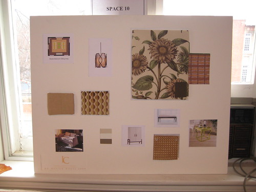
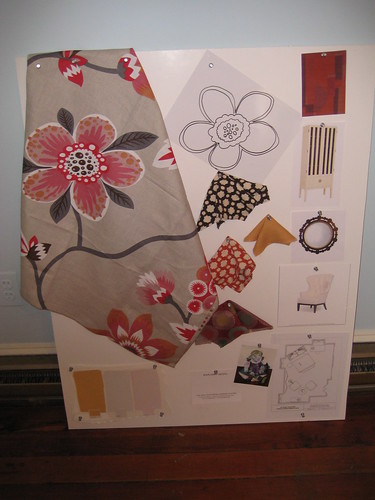
Going up the back stairs, the first room we came to was the Children's room. As the rectory doesn't actually have an inhabitants, this room was designed with a little girl who is at the Children's Hospital in mind, and will incorporate her artwork. The designer wasn't in the room, so I don't know all the details of the room, but I love the large floral fabric. It's interesting as well that the paint colors were almost identical to colors used in the Dining Room. It will look really nice in this room though, as it had 3 large windows and lots of light.
Children's Room
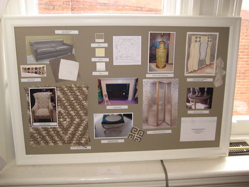
The next room along the hallway was a Sitting Room/Den. The design here was nice and classic, with a greek key theme. I want to steal the stool pictured bottom center though. In my old apartment building, people would frequently leave stuff they no longer wanted in the hallway, and it would invariably be gone in 24 hours. One night, I was walking up to my apartment with boyfriend, and there was a stool just like that, except not painted and gorgeous, a floor below me. I immediately said I had to have it, but boyfriend, always the voice of reason, said that I wasn't allowed because I already had way too much furniture for my studio apartment. I held my piece and thought I would just go get it in the morning. Alas, someone else saw how beautiful it was, and had snatched it up in the night. i'm still sad to this day, and boyfriend is no longer allowed to talk me out of things that I love. Rather, he's allowed to try, but I just don't listen. :)
Sitting Room Design Board
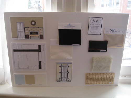
Connected to the Sitting Room was a Guest Bedroom. It currently has some crazy shelves all along one wall (the wall with the bed on the design board), so it will look quite different once it's all redone. It has a similar design sensibility to the Sitting Room and should flow well, but there were some elements I wasn't a huge fan of on the design board. Primarily it involved the bench at the foot of the bed being covered in some sort of white furriness, which I didn't like at all. I'm also not partial to sisal rugs, especially in a bedroom, but that was what was proposed for the room.
Guest Bedroom Design Board
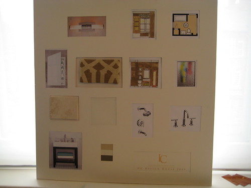
Back out in the hallway, the next room is the Master Bathroom. It's a small room, as to be expected in an old house, and the design was fairly safe, mainly just updating the look of the room with brown colors, which I tend to stay away from.
Master Bathroom Design Board
Connected to the Master Bath is the Master Sitting Room, which was being designed by the same firm. I thought the proposed layout was a little strange for a private room such as a master sitting room, having two loveseats facing each other. I think though that they were already in there and are being reupholstered, as there were two loveseats that look very similar to the ones on the board already in the room. The one piece that I loved in this room was the end table, two of which will form a coffee table arrangement. The bright pop of lime green and shape of them will help add a more modern element to a house where the design is getting increasingly fuddy-duddy.
Master Sitting Room Design Board
And the final room of the house tour - the Master Bedroom! I really should have done the tour in the opposite direction, as this was my least favorite design concept of the house, but we'll see when it's done. I love peacocks incorporated into design (see my old bathroom for example), but I think they need to be done in rich jewel tones, more like art deco, rather than the toned-down watercolor look below. I think this room will end up looking more like a museum, rather than a functional room.
Master Bedroom Design Board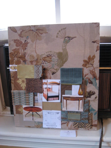
And so wraps up the 2009 DC Design House Bare Bones Tour. I am volunteering as a docent on May 2 (get in for free and get the inside scoop), so stayed tuned for the finished project!
No comments:
Post a Comment