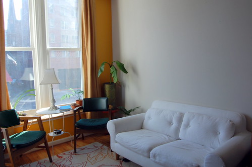
But now I have to decide how and what to actually do. I did some cruising around Apartment Therapy and the world wide web in general, and am no closer to deciding. For the most part, I think it will be my own photos that I will get printed, so I'm not too limited in how it will look. My Christmas present from boyfriend is not yet done, but when it is done, it will be a large (30" or so) square frame that is a collage photo of bright DC row houses with a gorgeous ginkgo tree in front. This may or may not end up on the gallery wall, depending on what I decide, as I mostly want smaller photos (8x10), and that would look funny I think. I also want to be able to mix it up a bit, trading photos in and out. With that said, here are some of my inspiration pictures:
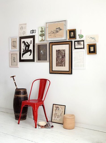
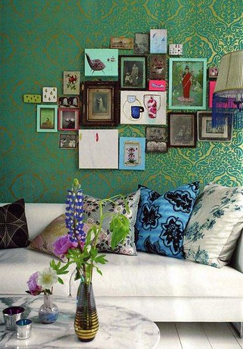
Randomly placed framed artwork:
Randomly sized artwork in a grid/geometric formation:
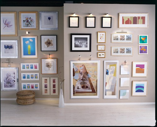
(Photo from Design Formula)
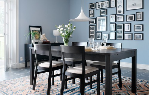
(Photo from Design Formula)
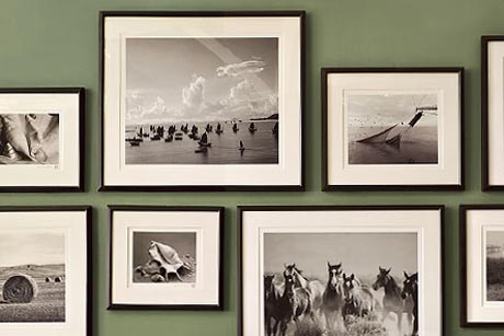
I like the black and white photos in all the same style frame.
(Photo from Apartment Therapy)

Using artwork as a border is a great idea.
Identically sized artwork in a grid:
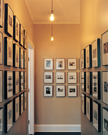
Even though the frames are all the same size, the photos are not identically sized. Nice way to add symmetry.
(Photo from Apartment Therapy)
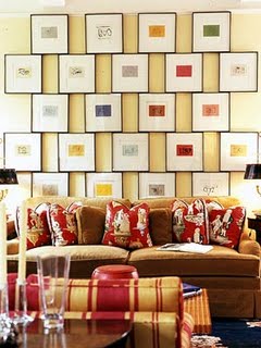
I've loved this off-set design for quite a while, but it's one of those things that you do once and then never change. I don't deal well without change.
(Can't remember where I got this photo - if it was you, let me know so I can add the credit)
Picture ledges:
Pictures clipped on wire:
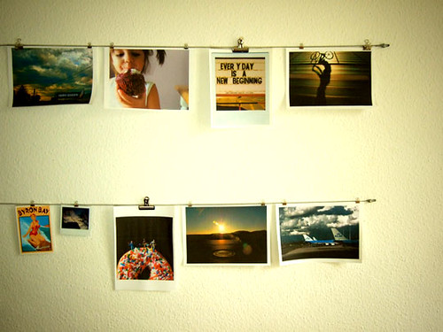
(Can't remember where I got this photo - if it was you, let me know so I can add the credit)

(Photo from Apartment Therapy)
My summary of how I feel about them
Randomly placed framed artwork:
The more organic and free-flowing arrangements are easy to add to over time, but tend to look cluttered and take a lot of work to lay out in the beginning I think. This one is my least favorite, I think.
Randomly sized & identically sized artwork in a grid/geometric formation:
Being an engineer, I naturally gravitate towards the geometric layouts, but because I want to change it up frequently, I worry that that becomes too much hassle. It wouldn't be too bad if I always use 8x10 photos horizontally orientated though, I guess.
Picture ledges:
These are a good solution to changing things up, but I think they tend to look better with a smaller number of large pieces. Also there is danger in devolving into a Pottery Barn catalog layout.
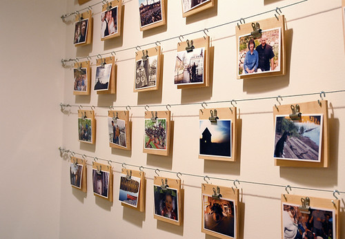
Pictures clipped on wire:
This is what I'm currently leaning towards, as it's the least work, and it means I don't have to buy a bunch of frames, which can get pricey. Not to mention it's super easy to change photos in and out, and I don't have to worry about changing the horizontal placement of photos. I'm a little worried it might read as dorm room though, so I'm hesitant.
What do you all think?
Randomly placed framed artwork:
Randomly sized artwork in a grid/geometric formation:

(Photo from Design Formula)

(Photo from Design Formula)

I like the black and white photos in all the same style frame.
(Photo from Apartment Therapy)

Using artwork as a border is a great idea.
(photo from {BLACK.WHITE.YELLOW.})
Identically sized artwork in a grid:

Even though the frames are all the same size, the photos are not identically sized. Nice way to add symmetry.
(Photo from Apartment Therapy)

I've loved this off-set design for quite a while, but it's one of those things that you do once and then never change. I don't deal well without change.
(Can't remember where I got this photo - if it was you, let me know so I can add the credit)
Picture ledges:
Pictures clipped on wire:

(Can't remember where I got this photo - if it was you, let me know so I can add the credit)

(Photo from Apartment Therapy)

This is my favorite of the clipped art methods, I think. Adds a bit more of a framed look.
(Photo from Apartment Therapy)
(Photo from Apartment Therapy)
And that doesn't even touch on the issue of matching frames, what color the frames should be, should the photos be black and white, or color, or should the colors match my living room, and so on.
My summary of how I feel about them
Randomly placed framed artwork:
The more organic and free-flowing arrangements are easy to add to over time, but tend to look cluttered and take a lot of work to lay out in the beginning I think. This one is my least favorite, I think.
Randomly sized & identically sized artwork in a grid/geometric formation:
Being an engineer, I naturally gravitate towards the geometric layouts, but because I want to change it up frequently, I worry that that becomes too much hassle. It wouldn't be too bad if I always use 8x10 photos horizontally orientated though, I guess.
Picture ledges:
These are a good solution to changing things up, but I think they tend to look better with a smaller number of large pieces. Also there is danger in devolving into a Pottery Barn catalog layout.
Pictures clipped on wire:
This is what I'm currently leaning towards, as it's the least work, and it means I don't have to buy a bunch of frames, which can get pricey. Not to mention it's super easy to change photos in and out, and I don't have to worry about changing the horizontal placement of photos. I'm a little worried it might read as dorm room though, so I'm hesitant.
What do you all think?

3 comments:
I like each for one reason or another... If it were me, I would work around the actual art that I had or could find good deals on. To do some of those, you would really need specific shapes that could end up being pricy.
I can't wait to see what you decide!
Thanks for the advice, Kasey! I realized that I can probably scrounge up enough frames that I currently have to figure out some sort of layout with what I have. The hard part will be figuring out what to put in them!
I think the same-size, same-frame thing looks really regimented and stark -- maybe too much so for your style. I like the idea of the photo-wires (kind of looked like the way you had the DC-street picture collage in your old place) but it does run the risk of dorm-roomyness.
I just realized I voted against the picture ledges because (in our house) every single frame would be shattered within the week from falling on the tile. I suppose that's possible in your case as well, but not quite so bad!
I've been trying to figure out how to do our dining room for a while now and can't decide -- maybe I'll get your input :-)
Post a Comment