Friday, September 12, 2014

Shed a Little Light on the Subject

When we moved, we left our dining room chairs behind, and have plans on buying a table, chairs, a buffet, light fixture, and a piano.  Currently the dining room holds our old table (which is a piece of crap), one folding chair, a stool, and a side table with all our frogs on it.  We've been searching for all of these things since we've moved, and haven't hit upon anything that's a complete slam dunk.  It's tricky, because I don't want everything to be all matchy-matchy, John and I have very different tastes, and those things all add up to a decent chunk of change.

When we looked at the house, I immediately knew the dining room light fixture had to change.  I don't have a picture, but it's a generic boob light, you know the kind of flush-mount fixture that looks like a boob and is in every rental ever.  I want some kind of chandelier or pendant, but haven't really narrowed it down much yet, that is, until I looked on Craigslist today and found an amazing light fixture:


My awesome paint rendition of what it would look like in the dining room.

It's a little out of our price range, but it's just so unique and the art-deco-ness of it would fit really well with our house I think.  Now I just have to convince John that he likes it too, which may be a bit of a challenge.  What do you think, is it amazing, or just too much?

Wednesday, September 10, 2014

Welcome to my New Home!

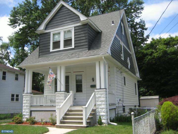
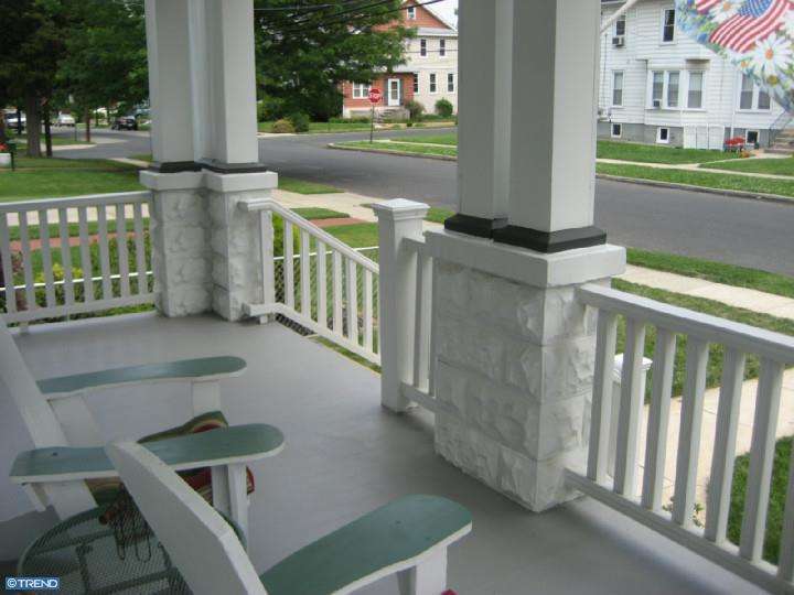
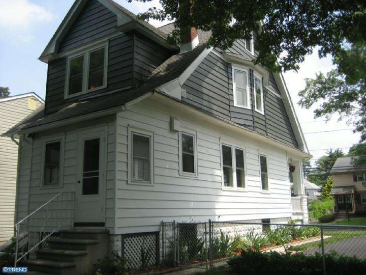
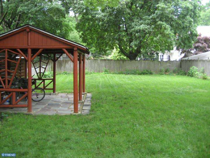
So since it's taking a while to get our house all set up, I figured I would give a tour using the listing photos.  These were taken why the previous owners lived there, so it will look different when I'm done, don't you worry.


The yard is just waiting for my new dog. :)

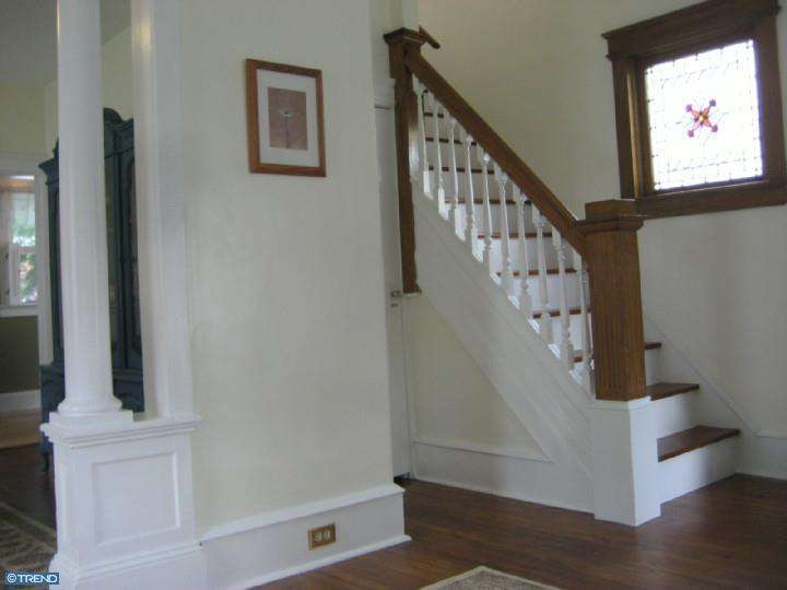
Moving inside, this is the living room, and the first of our three stained glass windows.  In the little nook by the stairs is the coat closet, and across from the stairs is the front door.

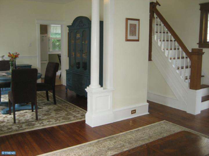
I love the columns going into the dining room.  The woodwork in the house is beautiful.

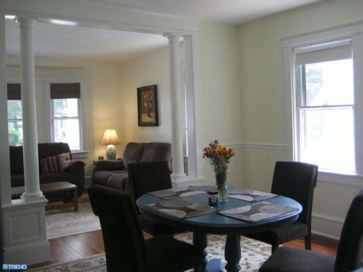
View from the dining room back into the living room.

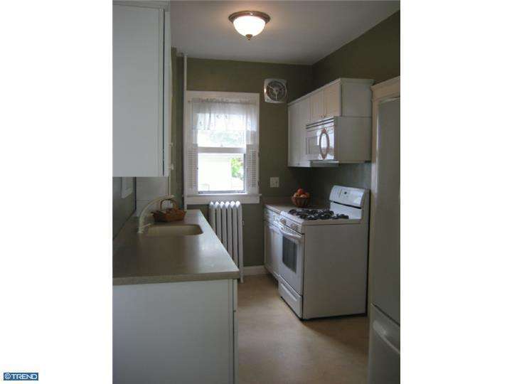
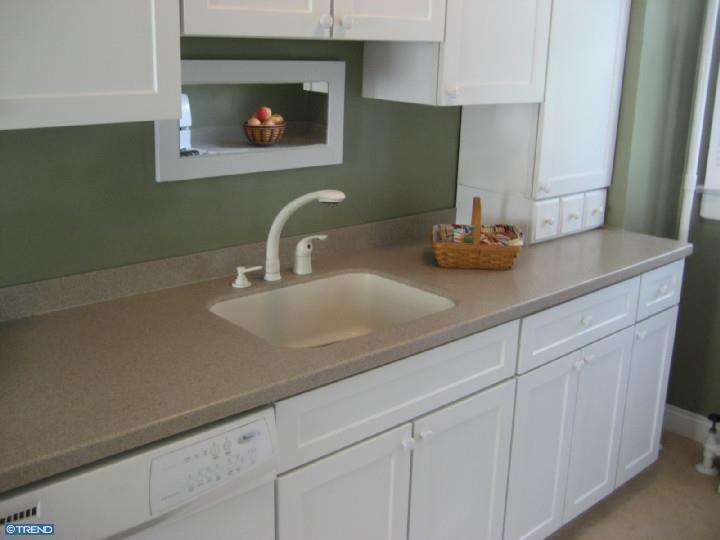
The previous owners redid the kitchen about 10 years ago.  It's not the colors I would have picked and it's a bit smaller than I would like, but it's workable.  


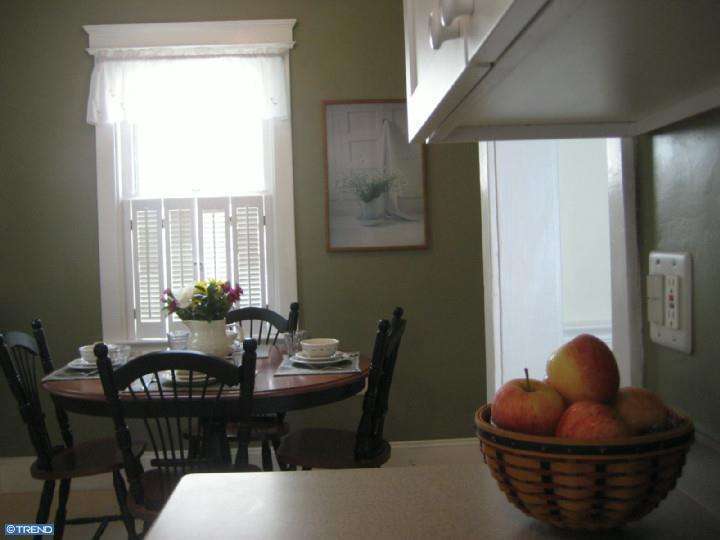
We haven't figured out yet what we want to do with the breakfast nook yet - I want to figure out how to make it into a more working space for the kitchen.

The mudroom.

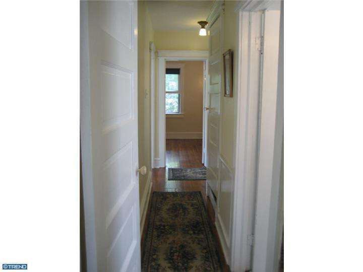
The upstairs hallway, looking into the back bedroom (John's office).

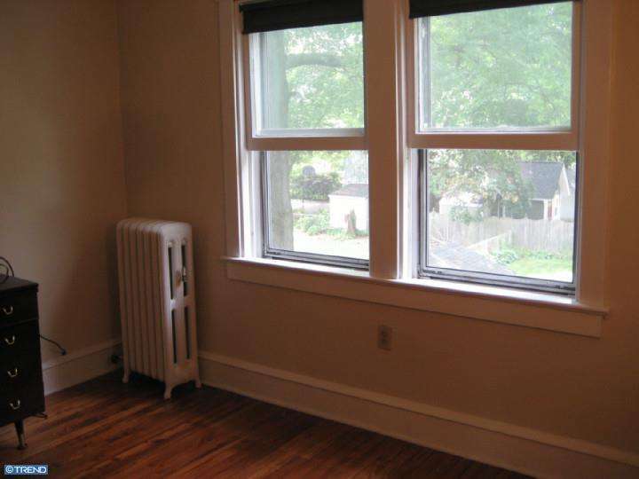
The back bedroom, which is John's office / frog room.

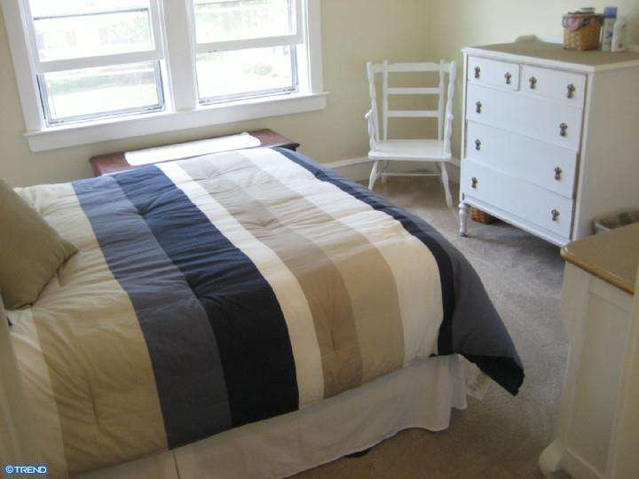
The middle bedroom, which is our bedroom.  I'm not a fan of the carpet, but it's in good shape, so we're leaving it alone for now.

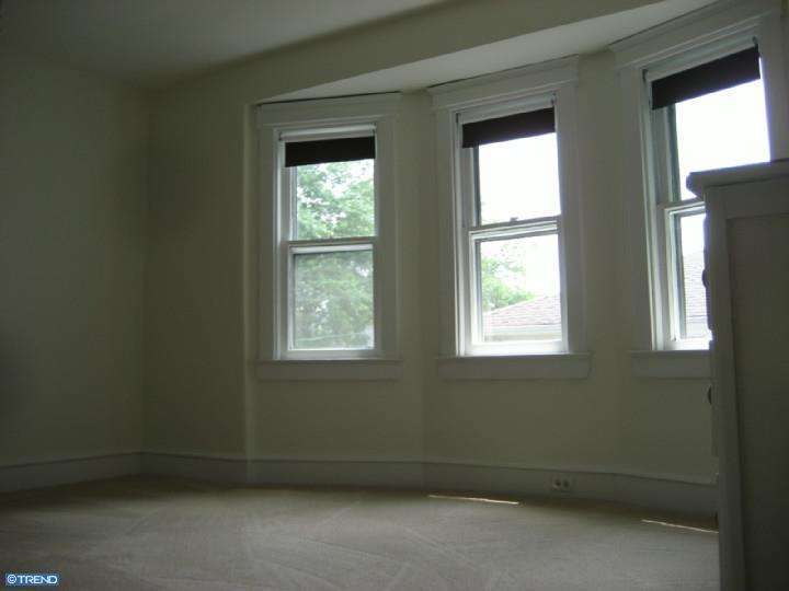
Front bedroom, aka guest bedroom, aka Laura's closet/dressing room.  Picture it without any furniture and the floor covered in my clothes and that's about what it looks like right now.

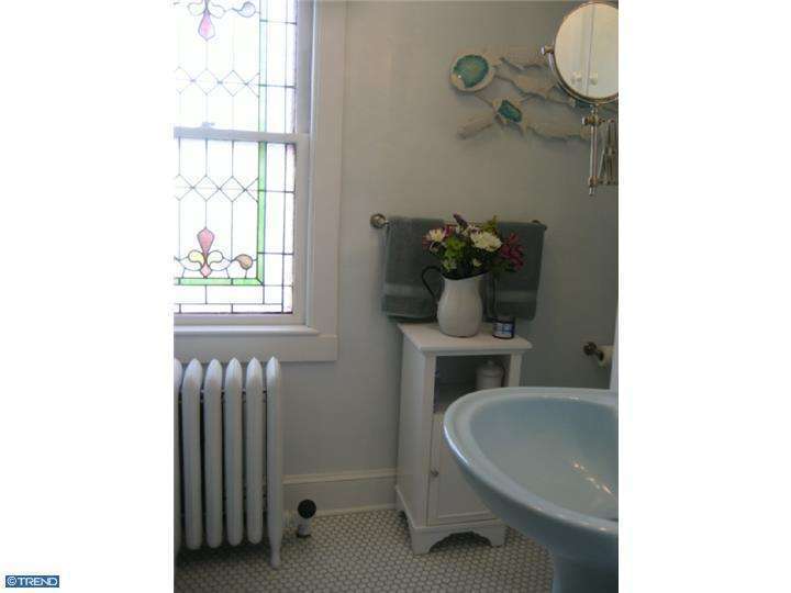
Our only bathroom.  It's really awkwardly laid out (literally no horizontal surfaces except for the window ledge) and the tub plumbing is not in good shape, so we might redo it at some point in the nearish future.  Also, stained glass window #2.

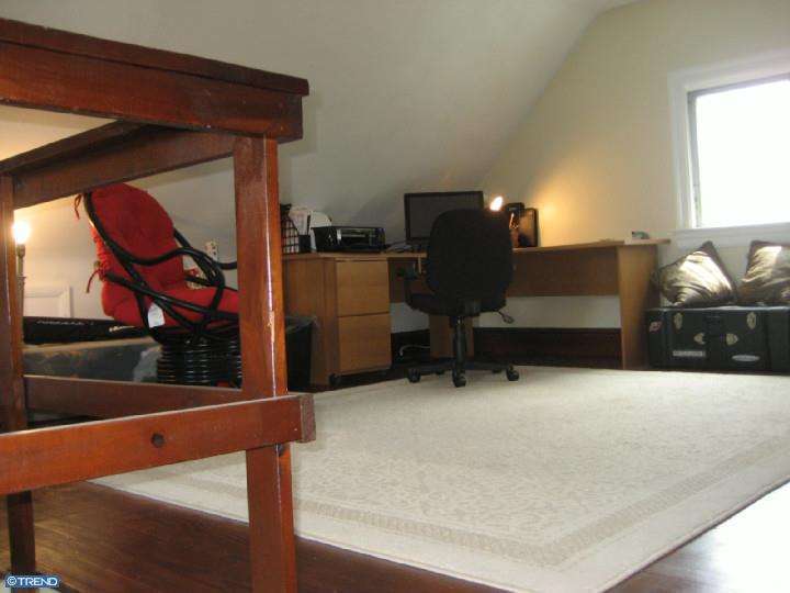
And the final room, the attic which will be my sewing studio!  A lot of work needs to be done here, though, so it will be a while.

 And there you have it - my new home!  What do you think?  Any suggestions for me?


Monday, September 8, 2014

Taking a snooze...

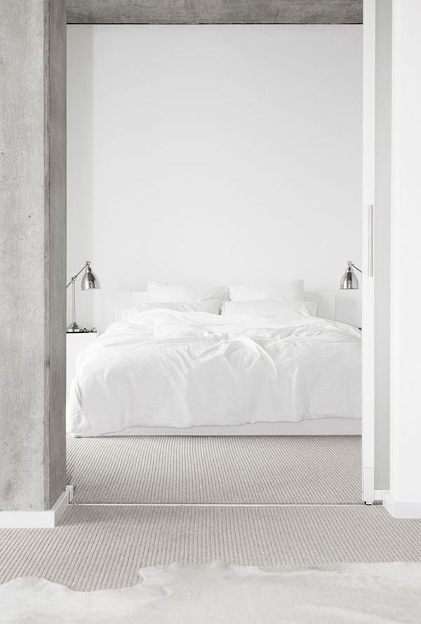
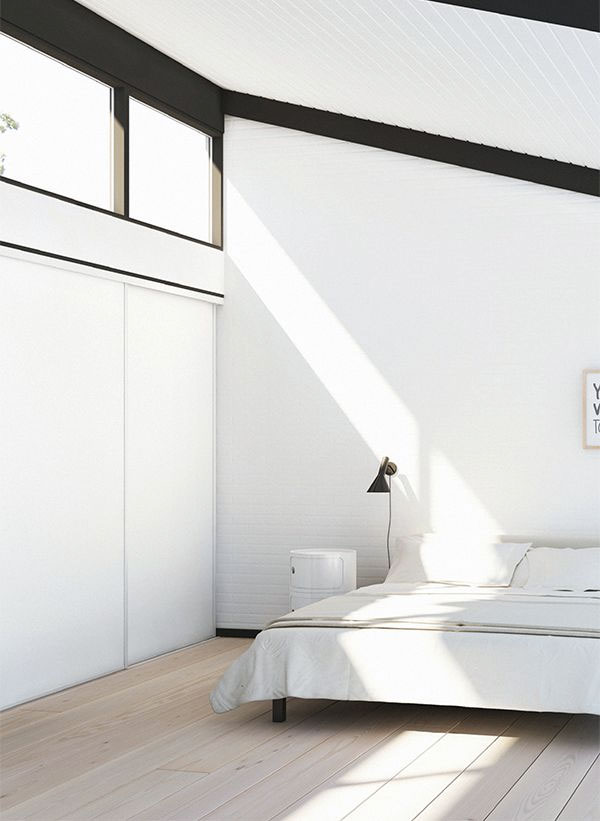
So we've been in our new house for about a month now, and things are slowly starting to look a little settled downstairs, but upstairs is a wreck.  I really want to get our bedroom set up, but there are a few problems in the way.  One, we have these big white cupboards from our old house that I want to retrofit into a wardrobe system, but it will take a bit of work and John has been having back problems off and on since we've moved, so they are literally sitting in pieces around our room.  The second big problem is our bed.  Unfortunately, our stairs are super steep, and the box spring just never made it upstairs, despite removing trim and gouging holes in the plaster (oops!).  That means we have been sleeping on our mattress on the floor in the middle of our room for a month.  Not exactly my cup of tea.

I've been thinking about what I want the room to look like overall, and ran across these photos on Apartment 34 today, and now I want a low simple white bed, but we'll see if I can convince John on that one. :)  What do think, soothing or too simple?


Related Posts

Blog Widget by LinkWithin