So I was perusing my Washington Post headlines today (I've become so well-informed since moving to D.C.), and I ran across this article on privacy rights over blood samples taken from newborns. Apparently pretty much every state takes blood samples to test for a bazillion different things, and many states dispose of them after a year or immediately, or whenever, but certain states like to hold on to them and use them for research. It was interesting until it got personal. You got it, Michigan holds them indefinitely and has recently moved them all to a new facility in Detroit to try and re-vamp Detroit as a medical research center. Somehow I don't see this happening, but I particularly don't like it because little dots of my blood are there.
I don't really think that they are going to do bad things with my blood, but still, it's an interesting ethical issue that they don't have to ask permission to do this. According to the WaPo article, they will start asking parents in Michigan for permission, but it's too much work to go back and ask the 3.5 million people who already have their blood in the center. The article claims that the parents can ask to have the center to remove the blood from the research pool, but I can find no information on the Michigan Neonatal Biobank website. Apparently they are legally bound to hold your blood indefinitely, just in case I ever need a tiny dried piece of my blood. So if you ever happen to see a mini-Laura wandering around, you can rest assured I did not change my life-long stance of not ever popping out a child, and instead Michigan decided it would be a good idea to clone me.
This is your fairly standard blog - primarily for my pictures, travel, interior design, fashion, etc, but with some random musings thrown in. Enjoy!
Tuesday, June 30, 2009
Monday, June 29, 2009
Murals: DC Edition #4
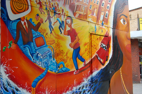
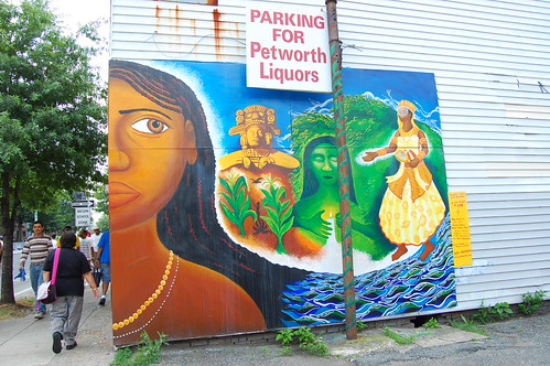
This was the weekend of festivals, but I actually only managed to make it to one. The first festival I wanted to go to was the Caribbean festival, which I've wanted to go to the past couple of years, but didn't make it. So the plan was to go to the parade at 11 a.m. on Saturday morning, and not pay to actually get into the festival, which shouldn't be that difficult. But unfortunately, despite getting up at 8 a.m., we made it to the parade route just after it finished. All was not lost though, as I did discover a mural that I had been meaning to make a trip out to see for a while now. It is titled "Daughter of Oshun in the New World", by Joel Bergner and is part of the Georgia Avenue Global Mural Project, funded by a grant from the DC Commission on the Arts & Humanities, which promote murals all around the city. It is located near Georgia Avenue NW and Kenyon Street NW.
The Things You Hear on the Metro
So I was riding the metro, reading my magazine, minding my own business the other day when I overheard a comment I just have to share. A couple of guys, either interns or just out of college were discussing facial hair and one of them said,
"I can only grow the anti-Hitler 'stache. You know, where it doesn't meet in the middle."
I giggled internally for the next two stops.
"I can only grow the anti-Hitler 'stache. You know, where it doesn't meet in the middle."
I giggled internally for the next two stops.
Labels:
DC
Friday, June 26, 2009
Changes in the Air
So I've been working on getting two etsy shops set up, which is part of the reason why I haven't been posting as much lately, one for my photography and one for purses and accessories. But I've run into a little problem in that I live in a studio apartment and there isn't a whole lot of room for large scale projects, such as ones that involve my sewing machine on a regular basis, not to mention it's not the most attractive thing for me to keep all my supplies in paper bags stuck in the corner. So I've been on a search lately for some piece of storage furniture to corral all my various supplies and finished products, but it would be even nicer if I could come across some kind of workstation that would actually fit in my apartment and allow me to leave my sewing machine set up. So I ran across the adjustable table below on craigslist today, and I'm tempted to get it for a dining/coffee table and converting my existing dining table into a workstation. I've posted before about my love of pedestal tables, so it is definitely a step in the right direction.
I'm conflicted though, as I love my little dining nook just the way it is, but it does make it difficult to entertain. What do you think, is it a good idea to upgrade the coffee table to include dining?


I'm conflicted though, as I love my little dining nook just the way it is, but it does make it difficult to entertain. What do you think, is it a good idea to upgrade the coffee table to include dining?


Labels:
Small Living
Thursday, June 25, 2009
Coffee Milk
My name is Laura, and I'm a coffee addict. I've been addicted to coffee for many, many years, and it stems back to a little thing my family called coffee milk. When my brothers and I were young, we would ask for coffee, but it's not so great for little kids, so my mom would put just a little bit of coffee in our milk, hence, coffee milk. I hadn't thought about this for years, until yesterday when I was reading the real simple blogs, and there was a post about coffee milk. Little did I know it's an actual drink, which is the state drink of Rhode Island, one of the three states I have never visited. Their version is a little different than mine though, using a coffee syrup instead of actual coffee. I may just have to take a trip up to Rhode Island and check it out soon. :)
Wednesday, June 24, 2009
What to do With a Blue Bike in a Red Apartment?
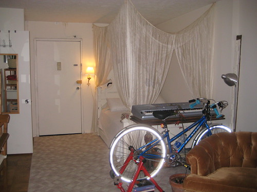
So last summer, when I bought my bike, I didn't really have a lot of choice in the color, but that's a whole other story. Needless to say, I ended up with a blue bike, despite my original choice of copper. My apartment is full of reds, oranges, yellows, everything but blue, and my original choice of bike would have looked right at home.
Habitually Chic posted today about the cuteness appeal of bike-riding, even mentioning how Chloe Sevigney's bike matches her hallway, as seen below, so that got me thinking about my bike solution.
When I got my bike home, it unfortunately just didn't fit in.
This lead to some grandiose plans of building a box to house my bike. I had designed it to be a 2' wide, 6' tall, and 6' long box, and the top two feet of the box would have fabric sides and would be a light box. So boyfriend and I took a trip to the Depot, despite his misgivings about how ridiculous a gigantic box would look in my apartment, and procured the necessary supplies. We hauled everything up to my apartment, and I took one look at the gigantic pieces of plywood, and said, no way. Unfortunately, at this point, I had a pile of wood and I had to do something with it. I had gotten several smaller pieces of wood for trim, so I played around in excel for a while (I'm a nerd), and came up with a design for a much smaller screen, to just hide it a bit.
Labels:
Design,
Small Living
Monday, June 22, 2009
Oooh, Pretty
I'm normally not a huge fan of afghans, but this one is just so beautiful.
 From Spamily via desire to inspire
 From Spamily via desire to inspire
Labels:
Design
Friday, June 19, 2009
A Walk Through History
So bushwoman was visiting me last week, and in the spirit of visiting DC, we of course had to check out all that the mall has to offer. One thing I actually hadn't managed to do yet was visit the newly re-opened Museum of American History. I was pretty excited, as I had heard about some cool things, like Julia Child's kitchen, Dorothy's red slippers, a transportation exhibit, the flag that inspired the Star Spangled Banner. It was neat, but I thought it would be a bit better than it was.

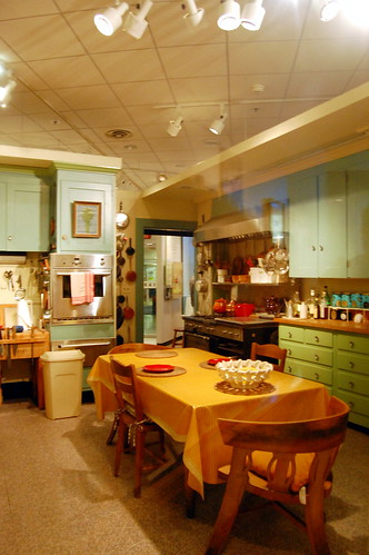
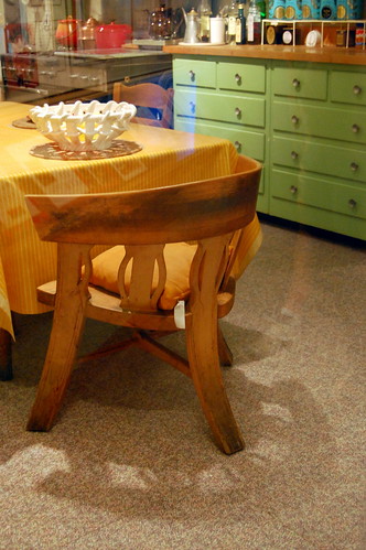
I loved this chair.
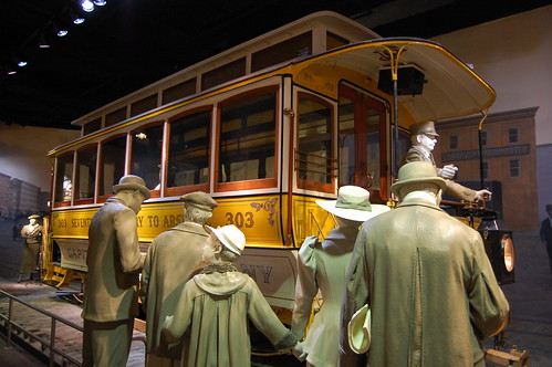
On to the Transportation Hall - DC once had Streetcars
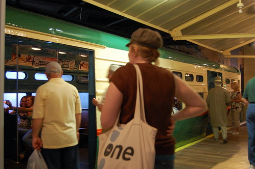
Bushwoman Boarding the L Train
Sidenote: Do you call it the L or the El? I've always said El, but the exhibit said L.

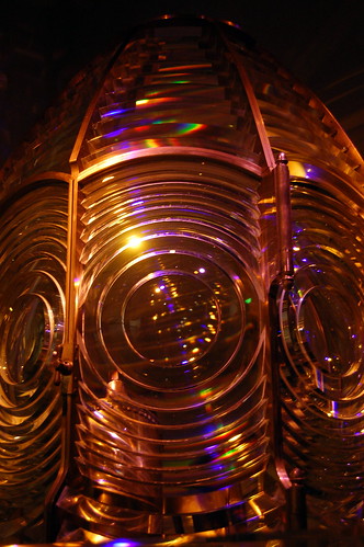
Lighthouse Lens

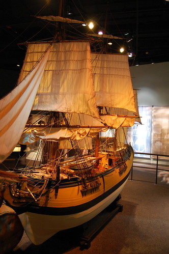
Awesome Model Ship
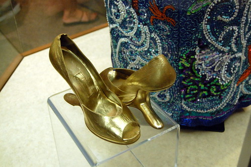
These shoes were by the ruby slippers, but I found them much more interesting.
So there you have it folks, my summary of American history, as told by the National Museum of American History. Doesn't quite seem to add up, huh?
Julia Child's Kitchen Recreated in the Museum


I loved this chair.

On to the Transportation Hall - DC once had Streetcars

Bushwoman Boarding the L Train
Sidenote: Do you call it the L or the El? I've always said El, but the exhibit said L.


Lighthouse Lens


Awesome Model Ship

These shoes were by the ruby slippers, but I found them much more interesting.

So there you have it folks, my summary of American history, as told by the National Museum of American History. Doesn't quite seem to add up, huh?
Labels:
DC
Wednesday, June 17, 2009
Elegance Evolves, But Perhaps Modeling Skills Going Down?
I ran across this ad in Harper's Bazaar, celebrating Vanity Fair's 90th anniversary. I thought it was a really well-done ad, with the exception that I thought the models did a substantially better job in the original photos. I've watched my fair share of America's Next Top Model, so I can do a photo critique with the best of them.
 The first comparison is all about the facial expression. The original photo has a look of ethereal elegance as she looks up, while the new photo is more seductive, looking down a little. I guess that works as well, but I prefer the original.


For the second set of pictures, I thought the model in the new photo was just a little bored looking. Again, it's all about the little chin lift versus keeping the face level, and the original photo has attitude even in the wrist, while the new model is kind of limp.


 The last comparison is an odd pose to begin with, but in my mind the new model did the worst job in emulating the old photo. The half-closed seductive eye on the original works with the coy hand, but the new model staring with an open eye straight at the reader is just strange.


 Which set do you prefer - the originals or the new photos?
 The first comparison is all about the facial expression. The original photo has a look of ethereal elegance as she looks up, while the new photo is more seductive, looking down a little. I guess that works as well, but I prefer the original.


For the second set of pictures, I thought the model in the new photo was just a little bored looking. Again, it's all about the little chin lift versus keeping the face level, and the original photo has attitude even in the wrist, while the new model is kind of limp.


 The last comparison is an odd pose to begin with, but in my mind the new model did the worst job in emulating the old photo. The half-closed seductive eye on the original works with the coy hand, but the new model staring with an open eye straight at the reader is just strange.

 Which set do you prefer - the originals or the new photos?
Labels:
ads
Friday, June 12, 2009
Multiple Takes
I'm normally somewhat of a purist when it comes to photos, only digitally editing to brighten up the colors, crop a little, etc, but every now and then I like to experiment. I really liked this picture of the statue in the middle of Logan Circle that I took a while ago, so I thought I would see how many variations I could come up with by editing.
Labels:
DC
Thursday, June 11, 2009
Metro Art: Wheaton Edition
Most of the Metro stations have some kind of artwork, mural, etc, and someday my plan is to ride the entire system and take photos of it all. These tiles are from the Wheaton station, and were gorgeous in the sun, but it was hard to capture fully. The starbursts were mirrored and really glittered.


Labels:
DC,
Graphic,
Transportation
Subscribe to:
Comments (Atom)

