This is your fairly standard blog - primarily for my pictures, travel, interior design, fashion, etc, but with some random musings thrown in. Enjoy!
Thursday, April 30, 2009
Random Annoyance of the Day
My spell-check is Canadian. At least, it likes to think it is. Why in the world would Microsoft Word want to change color to colour?
Wednesday, April 29, 2009
Laura's Travels: Philly Edition, No. 2
Continuing on with my trip to Philadelphia, after we hit up the Reading Terminal Market, the next stop is a must-see for any American, the Liberty Bell. Unfortunately, I didn't get to lick it, unlike Barney and Ted in the best show ever, but it was still pretty cool.


And finally, a picture of boyfriend, who is so important he must talk on his blackberry while we're sightseeing. :)

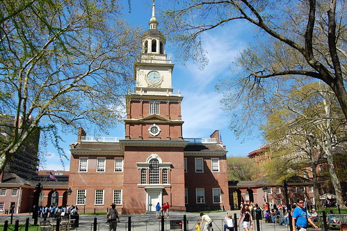
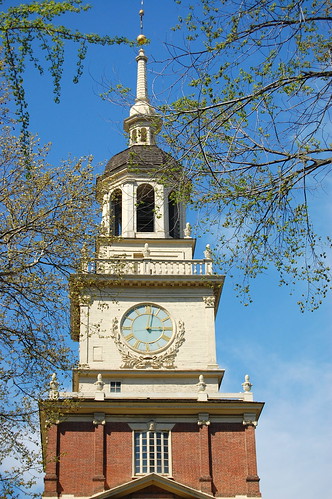
Around the corner, we next hit up Independence Hall, but didn't actually get to go inside.


In front of Independence Hall is a statue of Commodore Barry, who did something cool back in the day, I'm assuming. Unfortunately, I need to learn to frame my subjects a little better, as all five of the pictures I took of him were at this unfortunate angle.

And finally, a picture of boyfriend, who is so important he must talk on his blackberry while we're sightseeing. :)
Labels:
Travel
Search Me Out
So apparently Google released a new search tool yesterday, which helps search for difficult to find government public data. As someone who has to search for public data on a somewhat regular basis, I applaud their effort, but find their initial release puzzling. Currently you can only search for unemployment rates and populations for a particular state or county, according to the Google blog. I find this odd, because it's actually quite easy to get this data immediately from the Census Bureau website, as this is like the only public data that is easy to find. I may be a bit biased, as I do use the CB data quite a bit, and even get to play with the private data from time to time as part of my job, but I still think someone could find it quite easily. It will be interesting to see what they add to it next, as it has a lot of promise.
Tuesday, April 28, 2009
Laura's Travels: Philly Edition
This past weekend, I took a trip up to visit boyfriend's family, who live near Philadelphia, and also went into the city, for as much as I travel around, I've never actually been to Philly. I normally like to plan a bit more before a trip, but this time, all I did was google "things to do in philadephia" and I came up with a decent list.
Saturday morning, boyfriend, his grandmom, his aunt, and I took the train into the city from Morrisville, where his family lives. Unfortunately, the train was late, and and when it finally did arrive, it didn't quite manage to stop at the platform. After sitting on the tracks for a while, it finally reversed so we could get on. A slow 10 or 15 minutes later, we stopped on the tracks and the conducter came by to inform us that Amtrak had decided to spray the track for weeds, which makes the track very slippery, which was why it had slid past our station. We had to proceed slowly for a while before finally Amtrak gave us the signal that we could go full speed. Needless to say, we arrived later than we expected in Philly.
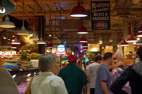
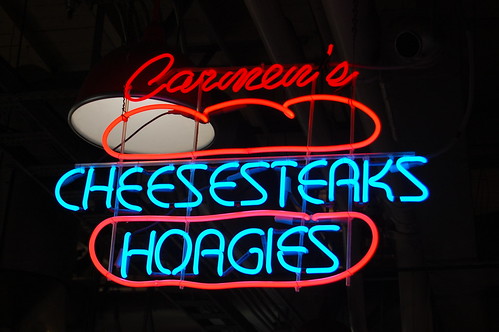
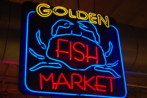
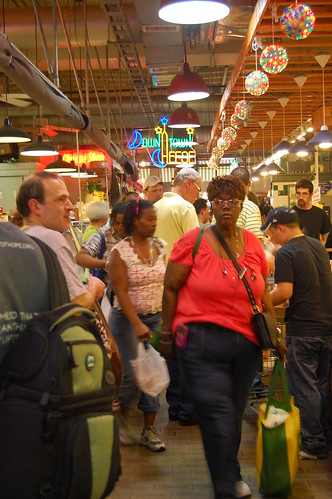
The train station is right next to the Reading Terminal Market, which was first on my list of top things to do in Philly. I love a good market, and this one was quite fun, with tons of yummy food. It also spoke to my love of neon signs, as you can tell from the pictures.

Next up: Let freedom ring!
Labels:
Travel
Monday, April 27, 2009
Man-Eating Alien Snake Plant!
So a while ago, back when I actually posted my photos, I posted some pictures of the Man-Eating Alien Snake Plant that I had taken in the San Francisco Botanical Gardens. Last Thursday, I went to Whole Foods after work to pick up some dinner, and lo and behold, they had the Man-Eating Alien Snake Plants for sale! Of course I had to buy one, so if I ever happen to disappear some day in the near future, you'll know what happened to me.

On a somewhat related note, has anyone ever read the children's book The Plant that Ate Dirty Socks? I was trying to explain it to boyfriend after I bought my plant, but he had no idea what I was talking about, but it's a really great book.

On a somewhat related note, has anyone ever read the children's book The Plant that Ate Dirty Socks? I was trying to explain it to boyfriend after I bought my plant, but he had no idea what I was talking about, but it's a really great book.
Got a Case of the Mondays?
It's one of those Mondays. Yes, I just looked down, and I have a huge stripe of deodorant on my knee. No idea how that happened.
Friday, April 24, 2009
Coffee, Coffee, Buzz, Buzz, Buzz
Tuesday was free cone day at Ben and Jerry's, and while I'm not an ice cream fan, I like me some coffee ice cream from time to time. But Ben and Jerry's doesn't have just plain ol' coffee ice cream, they have Coffee, Coffee, Buzz, Buzz, Buzz ice cream. Funnily enough, it didn't affect me near as much as the cup of coffee I just had, as I am literally buzzing at the moment. I know, this post is meaningless, but it's just a random post to let you all know I'm still alive and not taken over by the Small Cool contest or the massive GIS project I've been working on, pretty much every waking moment this week.
Wednesday, April 22, 2009
The Last Small Cool Post (Maybe)
It's my turn to go head to head in the Apartment Therapy Small Cool Contest today! I need all the help I can get, as the one I'm going against is quite popular, so please vote for me!
http://contests.apartmenttherapy.com/2009/small-cool/main/faceoff/20
http://contests.apartmenttherapy.com/2009/small-cool/main/faceoff/20
Labels:
Design,
Small Living
Tuesday, April 21, 2009
Small Cool Contest Continues....
The next round of the Apartment Therapy Small Cool Contest has begun, with the individual face-offs, to find the best apartment out of a bracket of 16. So far, 2 face-offs took place yesterday, 2 today, and mine is tomorrow! Make sure you sign in to vote for me then!
Labels:
Design,
Small Living
Monday, April 20, 2009
Up on a Pedestal
Labels:
Design
Friday, April 17, 2009
Ernst Haeckel and His Very Cool Prints
I love fishy things, and anything related to the ocean, pretty much. Any nature show that has underwater filming has me captivated. Somehow, I stumbled upon these prints, which are done by Ernst Haeckel, which depict all sorts of nature, but I'm primarily fascinated by his ocean-related ones. Ernst was a biologist, naturalist, among many other things, in the late 1800s/early 1900s, and his Kunstformen der Natur (Art Forms of Nature) contained 100 prints of various organisms. The three below were my favorites, but several others are in very high resolution on Wikipedia. The detail is amazing, and I'm thinking about printing off some of them some day, but for now I just look at them every now and then.
Thursday, April 16, 2009
Kitchen Beautification, Part 5
So I guess I left you all hanging on the kitchen, but I've been a little consumed with Small Cool fever this week. I'm a little disappointed in how things are turning out, as they are not capping the entries at 40, as the rules state, because they got so many entries at the end of the submission period. If they would have stopped at 40, I would have ended up at 8th place, which would have been a pretty much optimal position for the bracket, as I would have been the entry with the most votes in the bottom bracket. But alas, I'm currently in 9th, which is the worst position (I go against the first place entry), and there is one more day of entries. Oh well, I had a good run, and I'm impressed I did as well as I did.
But I digress from kitchen talk. It's all up in the air once again as to what I will do with the kitchen, surprise, surprise. I was talking with a friend last week, and it turns out there is the possibility of renting a row house with her and one of her other friends, which would be cheaper and the timing would be perfect. So if I do that, I'll leave the fugly kitchen for the next tenant to deal with, seeing as how I don't want to do a lot of work on the kitchen and move in four months. But, while I was at the top of my game in the Small Cool competition, boyfriend and I were scheming as to how we could improve the appearance of the kitchen for future pictures, as it really is the downfall of my apartment. Oh, the finalists get to submit 10 new pictures, so that's why we were thinking this. We had a few ideas, and I think they would work out really well, without even having to get permission. So here goes:
Appliances - can't really do anything without expense/permission, so they have to stay.
Cupboards - kind of the same boat as the appliances, but I could paint. I also had a brilliant idea to hide at least a few of them. I don't use the bottom cupboards a ton, as they house my pots and pans (I don't cook that often) and cleaning supplies (ditto). I could figure out a way to attach a skirt to the bottom of the countertop, in a neutral shade, to hide some of the nastiness, similar to what I did in the bathroom (glue guns work wonders).
Backsplash - As the third of the most hideous elements of my kitchen, I think I could locate some sort of sheet of metal/something that I could just temporarily prop up/attach to the wall to hide the blue/white wallpaper. This could potentially still be the pressed tin that I had suggested previously.
Walls - I had a brilliant thought regarding the walls. There are 2 full gallons of the wall color paint stored in the kitchen cabinets. I could totally just paint it for now and then repaint when I leave. Granted, it's a lot of work for 4 months of painted walls, but if it got me the competition championship, it would have been worth it.
So there you have it - a few non-committal options for updating a kitchen enough for pictures. I had a lot of fun brainstorming different ideas for the kitchen, so stay tuned, as this may become a regular feature!
Labels:
Design,
kitchen,
Small Living
Wednesday, April 15, 2009
Small Cool Fun Continues....
So my 48 hours of voting on my apartment are almost up! Check me out if you haven't done so already.
http://www.apartmenttherapy.com/dc/small-cool-2009/small-cool-2009-lauras-small-snug-tiny-division-29-081767
I'm doing so much better than I thought I would. And I totally bet that none of the other competitors have multiple spreadsheets tracking the progress of everyone's entries, as well as a project spreadsheet showing the possibilities and gaming the best position for everyone to be in so I win. :) I'm such a nerd.
Labels:
Design,
Small Living
Monday, April 13, 2009
I am small and cool enough!
Everyone must go immediately and vote for me! :)
http://www.apartmenttherapy.com/dc/small-cool-2009/small-cool-2009-lauras-small-snug-tiny-division-29-081767
http://www.apartmenttherapy.com/dc/small-cool-2009/small-cool-2009-lauras-small-snug-tiny-division-29-081767
Labels:
Design,
Small Living
Friday, April 10, 2009
Am I Small and Cool Enough?
I just pressed the submit button for my Small Cool entry for the Apartment Therapy contest! Now I just have to wait and see if they actually post it and then see if people actually like it. :) I'll definitely be posting a link if I do make it, so stay tuned for that!
Labels:
Design,
Small Living
Thursday, April 9, 2009
Glitter Your Way Out of the Recession
I love Martha, I really do. Back in the dorms, the girls called me Martha Stewart. But sometimes, I just have to laugh at her. My personal favorite quote comes from Top Chef, when she was a guest judge for the Quick Fire challenge, and someone made scallops. She said, moderately paraphrased, "Now is the perfect time for scallops. We go diving for these in Maine every year." Seriously, Martha, diving for scallops? Somehow I don't see that.
But I digress. I was reading my Washington Post headlines that I get emailed to me everyday, and come across this little gem of an article teaser - "Martha Stewart has a plan for how everyone can endure the economic crisis: by glittering, embossing and beading." It made a little more sense on reading the article, as her reasoning is that "People are staying home and enjoying it by crafting and beautifying their home with decorating and cooking. They can't afford to travel, but they can afford a [$23] glitter kit." I still had to laugh though....only Martha would think of glitter as a solution to a financial crisis.
But I digress. I was reading my Washington Post headlines that I get emailed to me everyday, and come across this little gem of an article teaser - "Martha Stewart has a plan for how everyone can endure the economic crisis: by glittering, embossing and beading." It made a little more sense on reading the article, as her reasoning is that "People are staying home and enjoying it by crafting and beautifying their home with decorating and cooking. They can't afford to travel, but they can afford a [$23] glitter kit." I still had to laugh though....only Martha would think of glitter as a solution to a financial crisis.
Labels:
Musings
Wednesday, April 8, 2009
Kitchen Beautification, Part 4
The voting is still open for the Turquoise kitchen color scheme, but I'm throwing another option in the mix! Because the rest of my apartment is full of reds, yellows, and pinks, I am leaning towards a cooler color for the kitchen, but at the same time, I don't want to overwhelm my small apartment with color. I'm afraid it might be too much to throw a bunch more teal and turquoise in the kitchen, so I went searching for some more tame alternatives to cooling down the apartment color level. I found these two from Living, etc., and really like the mix of cream, silver, and weathered wood floors, but that introduced a whole other level of kitchen reno in a rental - redoing the floors.
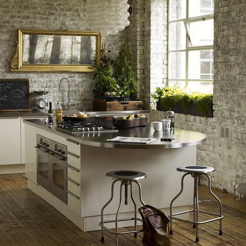

I only came up with one option for this color scheme, which utilizes the tin backsplash, the cream painted cupboards, and the stainless appliances. Obviously, this would work as well with the existing floors, but I definitely like the looks of the wood floor better. I did a little price checking, and I can get laminated flooring from Ikea for $50-$100, depending on how picky I am about the color.
I figured I would throw some of the popular configurations from yesterday in the mix, and see what people are feeling like today! As usual, let me know what you think and any suggestions are more than welcome!
Thanks for voting and stay tuned for more kitchen design!
(Top 2 photos: courtesy of Living, etc)
Thanks for voting and stay tuned for more kitchen design!
(Top 2 photos: courtesy of Living, etc)
Labels:
Design,
kitchen,
Small Living
Tuesday, April 7, 2009
Kitchen Beautification, Part 3
So I have two votes for white appliances, two votes for silver appliances, and two votes for "other", whatever that means. No one seems to like black, which I find interesting. So I'm no closer to deciding what I would like for my appliances. Over the weekend, I thought I should revamp my approach, and scour my house books for pictures that had an overall feel of what I wanted. Seeing as how I don't know what I want, it turned out to not be as productive as I had hoped, but there were a couple of options.
The first option that I found in my house books is a color scheme based on a turquoise, ivory, yellow, anything in that sort of family. The picture below is a couple of pages from my house book on the kitchen floor.
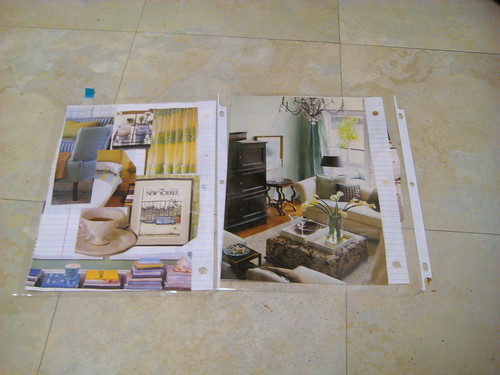
The first option that I found in my house books is a color scheme based on a turquoise, ivory, yellow, anything in that sort of family. The picture below is a couple of pages from my house book on the kitchen floor.

In order to translate this into my kitchen, I'm thinking of keeping the walls ivory, painting the cupboards a turquoise color, and accenting with yellows and creams. For the backsplash, there are two different treatments that I'm thinking of. One treatment that I like a lot is a pressed tin backsplash. It's cheaper than tile, and is quite easy to install, so I think it's a good option. I can go either with a silver color, or it could be painted, but I'm leaning towards silver. The second treatment would be a subway tile backsplash, in a turquoise color.
For the pressed tin backsplash, I've done two mock-ups (don't laugh at my paint skills), for the different appliance options. The first one is leaving them the way they are, to mimic white, and second one with stainless steel, which I think maybe is a bit much with the backsplash. In this case, it might be nice to paint the backsplash to match the walls, which are a creamy color. It's hard to tell in the picture, because of the cool lighting, but the overall coloring of the kitchen currently is a warm, creamish color, which fits much better with the house book pictures above.


For the pressed tin backsplash, I've done two mock-ups (don't laugh at my paint skills), for the different appliance options. The first one is leaving them the way they are, to mimic white, and second one with stainless steel, which I think maybe is a bit much with the backsplash. In this case, it might be nice to paint the backsplash to match the walls, which are a creamy color. It's hard to tell in the picture, because of the cool lighting, but the overall coloring of the kitchen currently is a warm, creamish color, which fits much better with the house book pictures above.


The other option is to paint the cupboards a creamy color to match the walls, and then have a turquoise tile backsplash, as shown below in 3 different variations.


So this is a first cut at a kitchen revamp that could potentially be done in a rental, for low cost. Obviously, the kitchen appliances are a big investment, but as I said before, I think they need to be replaced and that would be a landlord sort of issue. Estimating on the high side, the rest of the cost breakdown:
Primer and paint for cupboards ~ $50
Pressed tin backsplash or tile backsplash ~ $50
So there you have it folks, my first attempt, with five different options. Let me know which one you like best!
Any thoughts, suggestions, improvements? I have at least one more idea/color scheme up my sleeve, so stay tuned for that next!
Labels:
Design,
kitchen,
Small Living
Monday, April 6, 2009
Notre Dame
To wrap up my old scanned pictures, here are a few from Notre Dame.
I know everyone who visits Notre Dame takes this same picture, but I still like it.

I know everyone who visits Notre Dame takes this same picture, but I still like it.
Who doesn't love playing on a see-saw outside of a beautiful cathedral?

Labels:
black and white,
Travel
Friday, April 3, 2009
The Art of Shoes
I love shoes, as most girls do. I was browsing last year's small cool contest entries on Apartment Therapy, and ran across this idea for storing/displaying shoes in an entryway, and really liked it (despite the fact the shoes aren't my style at all). I thought it was really clever, and if I ever have an actually entryway, I would like to try something similar.


Labels:
Design
Kitchen Beautification, Part 2
So now that I've outlined what I currently have, I'm going to get right into what I would change in my kitchen. Before that though, I found out yesterday that my apartment really has not been updated at all for 45 years. I was looking to see if any condos in my building were for sale, and one was, the ad for which stated it had been owned by the same owner since 1965 (the building was built in 1964). The pictures showed the identical kitchen cabinets, sink, counter, bathroom vanity, medicine cabinet, pink tile, you name it. Although they did replace the fridge and stove, which I'm beginning to think mine are still from 1964. I think I have a little ammo now if I want to convince my landlord she should redo the kitchen.
I think the place to start with the kitchen is the appliances. They are the most major and costly element and can set the tone for the entire kitchen. There are two basic options here, either replacing or refinishing in some way. In my opinion, especially if they are 45 years old, they need to be replaced. I don't think either of them work very well at all, and I think this is my best bet. I did a little checking, and the minimum I could get a new fridge and stove for would be around $700, so I don't know how my landlord will feel about that. So my backup plan is to refinish them. I did a little research and there are a couple of different ways this can be accomplished. I will just stick to the basics, but it is possible to be creative here, as I've posted before.
Option 1 is to paint with appliance paint. This one is ideal, as there aren't a lot of options that work with a range top, but it is possible to get heat resistant appliance paint. This can be messy and time consuming, and given my attention to detail, especially when painting, may not be the best for me. It's nice though because it gives a wide range of color and finish options. This is fairly inexpensive and I could probably do the whole project for under $50.
Option 2 is a variation on the painting, and involves liquid stainless steel. This is basically resin with tiny particles of stainless steel in it, and it seems like a good product, but I think it's pretty apparent it's not really stainless steel in the zoomed out picture. I'm not entirely sure I want to go with stainless steel anyway, but I'll keep it on the list. It would be a little more expensive than the appliance paint, but still reasonable.


Option 3 also involves the stainless steel look, but it's really a contact paper type solution called SoftMetal Faux Stainless Steel Film. I was really impressed with the pictures on the website, so I ordered a sample sheet of it to see what it looks like in person. It is probably the most expensive option of the 3, but still well under $100 to redo both the fridge and the stove. The issue with this option though, is that it is heat resistant enough to cover the front of the oven, but not for the range top, so the top of the stove would still be hideously almond-colored. I would have to do some soft of combination here with the appliance paint or the liquid stainless steel. Another cool thing about the film is that it is essentially mess-free, and bends around surfaces easily. If I went this route, I would probably recover the counter-top as well with this material.

 Here is a better picture of the floor, which is my limiting factor. It definitely has a warm tone to it, which is what makes me hesitant about bringing in the cool-colored stainless steel.
So there you have it folks, the many options for my fridge and stove. Ideally, I will be able to replace them, but even then I have to decide what I want them to look like. Seeing as how the floor is the one element I want to keep, I want it to blend as best as possible with that, and I'm not sure how I feel about the stainless look with the floor. Seeing as how my usual indecision is coming through, I decided to put the decision to my readers, so please let me know what you think in the poll!
*If you pick other, please leave a comment saying what you think.
Stay tuned next time around for the cabinet options!
(Photos courtesy of: 1 & 2 - Thomas' Liquid Stainless Steel, 3 & 4 - Glass Decor and More)
I think the place to start with the kitchen is the appliances. They are the most major and costly element and can set the tone for the entire kitchen. There are two basic options here, either replacing or refinishing in some way. In my opinion, especially if they are 45 years old, they need to be replaced. I don't think either of them work very well at all, and I think this is my best bet. I did a little checking, and the minimum I could get a new fridge and stove for would be around $700, so I don't know how my landlord will feel about that. So my backup plan is to refinish them. I did a little research and there are a couple of different ways this can be accomplished. I will just stick to the basics, but it is possible to be creative here, as I've posted before.
Option 1 is to paint with appliance paint. This one is ideal, as there aren't a lot of options that work with a range top, but it is possible to get heat resistant appliance paint. This can be messy and time consuming, and given my attention to detail, especially when painting, may not be the best for me. It's nice though because it gives a wide range of color and finish options. This is fairly inexpensive and I could probably do the whole project for under $50.
Option 2 is a variation on the painting, and involves liquid stainless steel. This is basically resin with tiny particles of stainless steel in it, and it seems like a good product, but I think it's pretty apparent it's not really stainless steel in the zoomed out picture. I'm not entirely sure I want to go with stainless steel anyway, but I'll keep it on the list. It would be a little more expensive than the appliance paint, but still reasonable.


Option 3 also involves the stainless steel look, but it's really a contact paper type solution called SoftMetal Faux Stainless Steel Film. I was really impressed with the pictures on the website, so I ordered a sample sheet of it to see what it looks like in person. It is probably the most expensive option of the 3, but still well under $100 to redo both the fridge and the stove. The issue with this option though, is that it is heat resistant enough to cover the front of the oven, but not for the range top, so the top of the stove would still be hideously almond-colored. I would have to do some soft of combination here with the appliance paint or the liquid stainless steel. Another cool thing about the film is that it is essentially mess-free, and bends around surfaces easily. If I went this route, I would probably recover the counter-top as well with this material.

 Here is a better picture of the floor, which is my limiting factor. It definitely has a warm tone to it, which is what makes me hesitant about bringing in the cool-colored stainless steel.
So there you have it folks, the many options for my fridge and stove. Ideally, I will be able to replace them, but even then I have to decide what I want them to look like. Seeing as how the floor is the one element I want to keep, I want it to blend as best as possible with that, and I'm not sure how I feel about the stainless look with the floor. Seeing as how my usual indecision is coming through, I decided to put the decision to my readers, so please let me know what you think in the poll!
*If you pick other, please leave a comment saying what you think.
Stay tuned next time around for the cabinet options!
(Photos courtesy of: 1 & 2 - Thomas' Liquid Stainless Steel, 3 & 4 - Glass Decor and More)
Labels:
Design,
kitchen,
Small Living
Thursday, April 2, 2009
Kitchen Beautification, Part 1
I have an ugly kitchen. I know everyone who rents says that, and they really aren't that bad, but still. It's not me at all. Kitchens can be especially difficult if you rent, as most of the things have to be done by the owner. I actually have probably a better chance of actually changing the kitchen though, as I rent a condo from a single owner, rather than renting an apartment with a management company and rules, and all that. I'm currently debating moving though when my lease is up in September, so for the time being, I'm going to plan my dream kitchen in my head and leave it alone, at least until I decide if I want to stay or not. As I'm still searching for my new design buddy, the blog will be my new outlet for musing about different options. I'll start off by listing off what the before conditions are, along with any constraints.
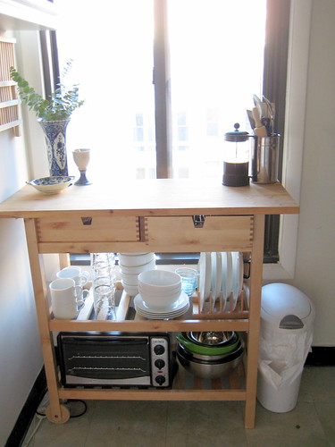
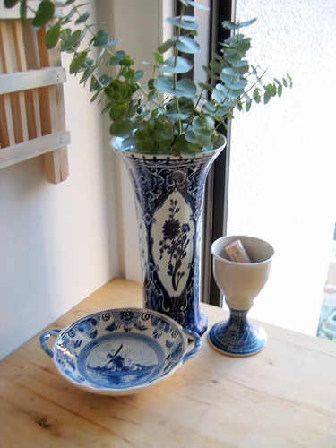
As far as the color scheme goes, I've never really used blue before in design. It's odd to say, but I don't think my mom ever did either, so it's just something I've grown up without. I have taken advantage of the blue though, and brought out my Delft china. This is one thing that I would love to continue to be able to display, as it's meaningful to me, but I'm not sure what to do if I get rid of the blue.
As far as constraints go, I think the main things that I don't mind too terribly are the floor, despite it being a cheapo solution, and the wall color. I'm usually more of a fan of pure white rather than cream, but it's a generic apartment solution to paint the whole place the same color, so it's fine.
So there you go, folks! A pseudo-blank slate that I will be working through the design for over the next couple of days. Again, I'm not sure how much of it all will be feasible, but I have a few ideas up my sleeve as to what I can do to liven it up. Stay tuned for more!
Current Kitchen Design
Size - 8'x8' (approximately, I need to remeasure).
Paint color - Cream (swiss coffee to be exact), which matches the rest of the apartment.
Cupboards - Country style, reddish-brown stain, crappy condition.
Appliances - Almond finish, poor working condition (vent doesn't work, oven is temperamental, and the fridge does weird things to my food).
Backsplash - Blue and white fake-tiled wallpaper.
Countertop - White with gold flecks laminate, metal-edged, which is only one foot wide. To mitigate the counter space crisis, I've also purchased a butcherblock storage unit that is unfinished natural wood. This is also to be considered in the final design.
Floor - Stick-on vinyl tiles, sea-green variegated.
Current Kitchen Design
Delft China
As far as the color scheme goes, I've never really used blue before in design. It's odd to say, but I don't think my mom ever did either, so it's just something I've grown up without. I have taken advantage of the blue though, and brought out my Delft china. This is one thing that I would love to continue to be able to display, as it's meaningful to me, but I'm not sure what to do if I get rid of the blue.
As far as constraints go, I think the main things that I don't mind too terribly are the floor, despite it being a cheapo solution, and the wall color. I'm usually more of a fan of pure white rather than cream, but it's a generic apartment solution to paint the whole place the same color, so it's fine.
So there you go, folks! A pseudo-blank slate that I will be working through the design for over the next couple of days. Again, I'm not sure how much of it all will be feasible, but I have a few ideas up my sleeve as to what I can do to liven it up. Stay tuned for more!
Labels:
Design,
kitchen,
Small Living
Design Buddy Auditions
So boyfriend, as much as he loves me, is getting sick of constantly being asked his opinion regarding design. Therefore, I need to find a design buddy. Someone who loves design like I do and will be there for me to bounce ideas off of, as well as come up with ideas of their own. Anyone want the job?
Labels:
Design
Plum for a Change
I was looking around at last year's Small Cool contest on Apartment Therapy, as it's a good place to see a bunch of neat ideas in one place. I ran across this apartment, which overall, I didn't like extremely much, as it did seem very impersonal, but I do love the artwork over the dining room table. I might take it as inspiration and start adding a deep plum color into my color scheme to go along with the reds and oranges, which I think would add a little sophistication.
 (Photo courtesy of Apartment Therapy)
 (Photo courtesy of Apartment Therapy)
Labels:
Design,
Small Living
Wednesday, April 1, 2009
Exotic Seating
Sometimes I really wish I lived in Europe. Especially when I run across furniture stores like La Maison Coloniale. I'm in love with the wooden chairs in both of these pictures, with their Asian flair.


(Photos courtesy of La Maison Coloniale)


(Photos courtesy of La Maison Coloniale)
Labels:
Design
FedEx as Fashion
I've seen bags and wallets made out of the Tyvek evelopes from the USPS and FedEx before, and it's been on my list for a while now to try and do something similar. I ran across this one today, and it definitely ups the ante in style.

(photo courtesy of www.lizania.com)

(photo courtesy of www.lizania.com)
Happy April Fool's Day!
So Gmail got me for about 10 seconds this morning with their autopilot system. It never fails to amaze me how in depth their April Fool's jokes are. Last year's was pretty great though, with the amount of background that went into the space colony thing.
In other news, the Washington Post elephant and donkey are back. Back in December, they disappeared, and I thought they were going to get a new paint job, but no, they looked identical this morning to the way they did when they went away. Maybe they were kidnapped? Who knows. It was a little anti-climatic though, I was disappointed


In other news, the Washington Post elephant and donkey are back. Back in December, they disappeared, and I thought they were going to get a new paint job, but no, they looked identical this morning to the way they did when they went away. Maybe they were kidnapped? Who knows. It was a little anti-climatic though, I was disappointed


Subscribe to:
Posts (Atom)
